Project Description
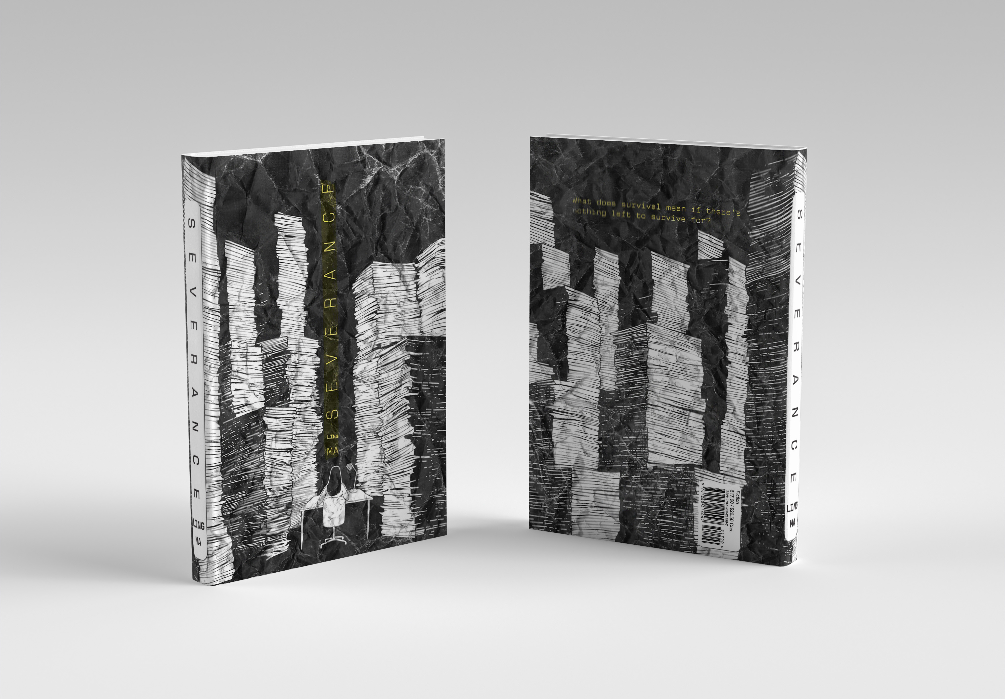
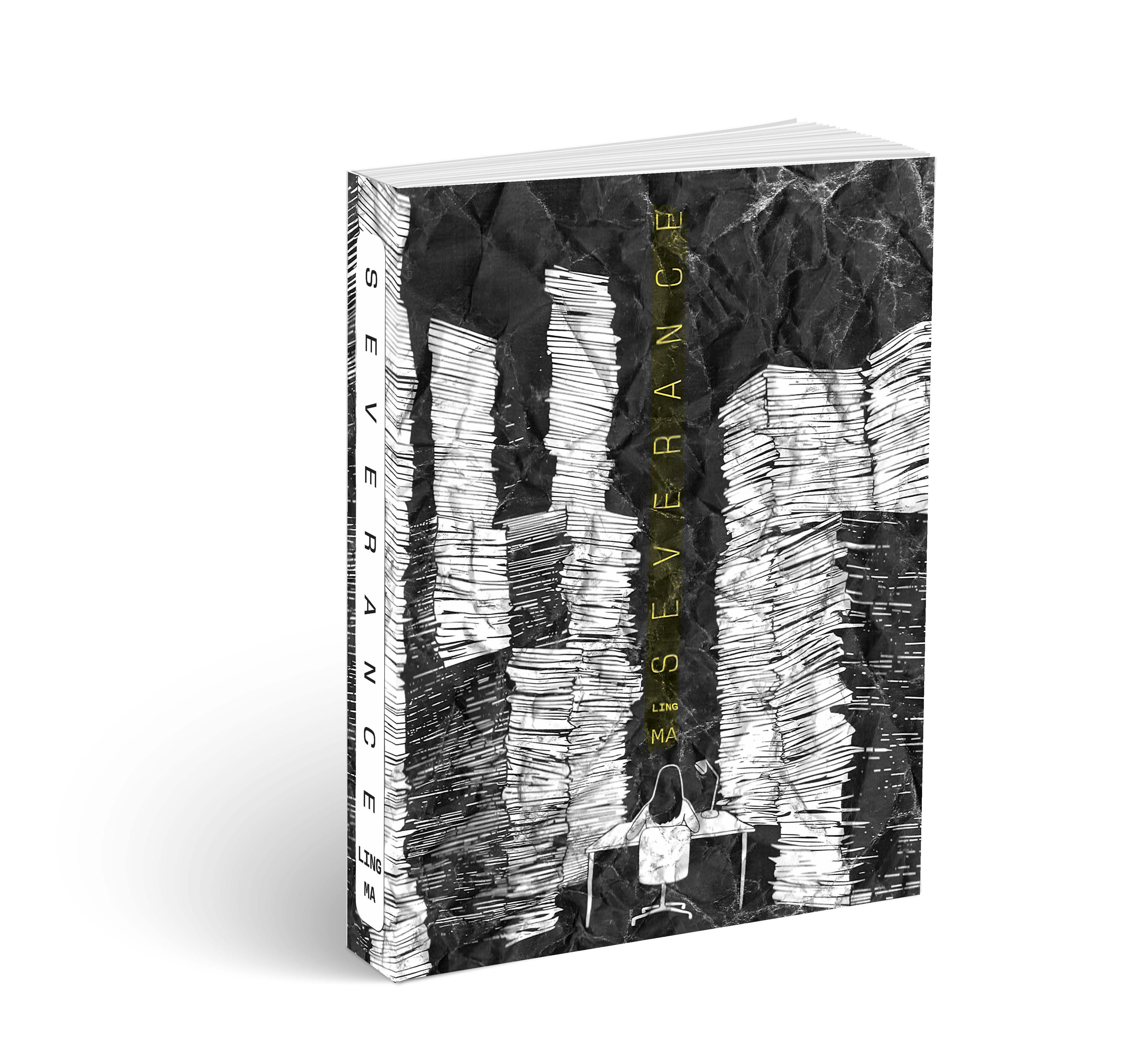
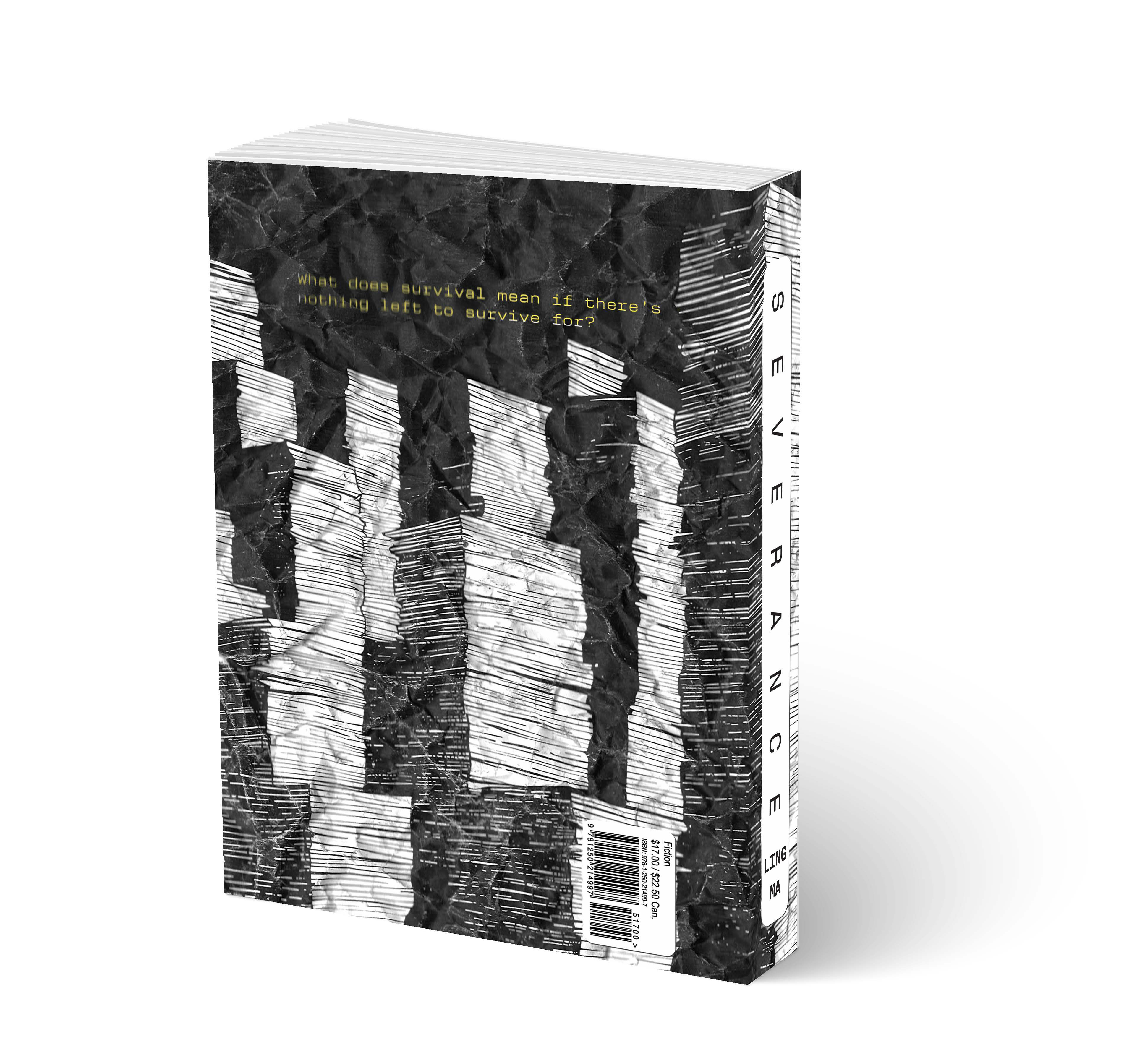
Severance is a book cover redesign that explores repetition, burnout, and emotional erosion through physical process. The design was repeatedly run through a printer and copier, allowing distortion, misregistration, and tonal breakdown to accumulate naturally. Rather than correcting these imperfections, the degradation became the visual language. The rigid grid reflects corporate routine, while the gradual loss of clarity mirrors the novel’s themes of identity erosion. The final cover captures a moment within that cycle of monotony and decay.
Design Showcase
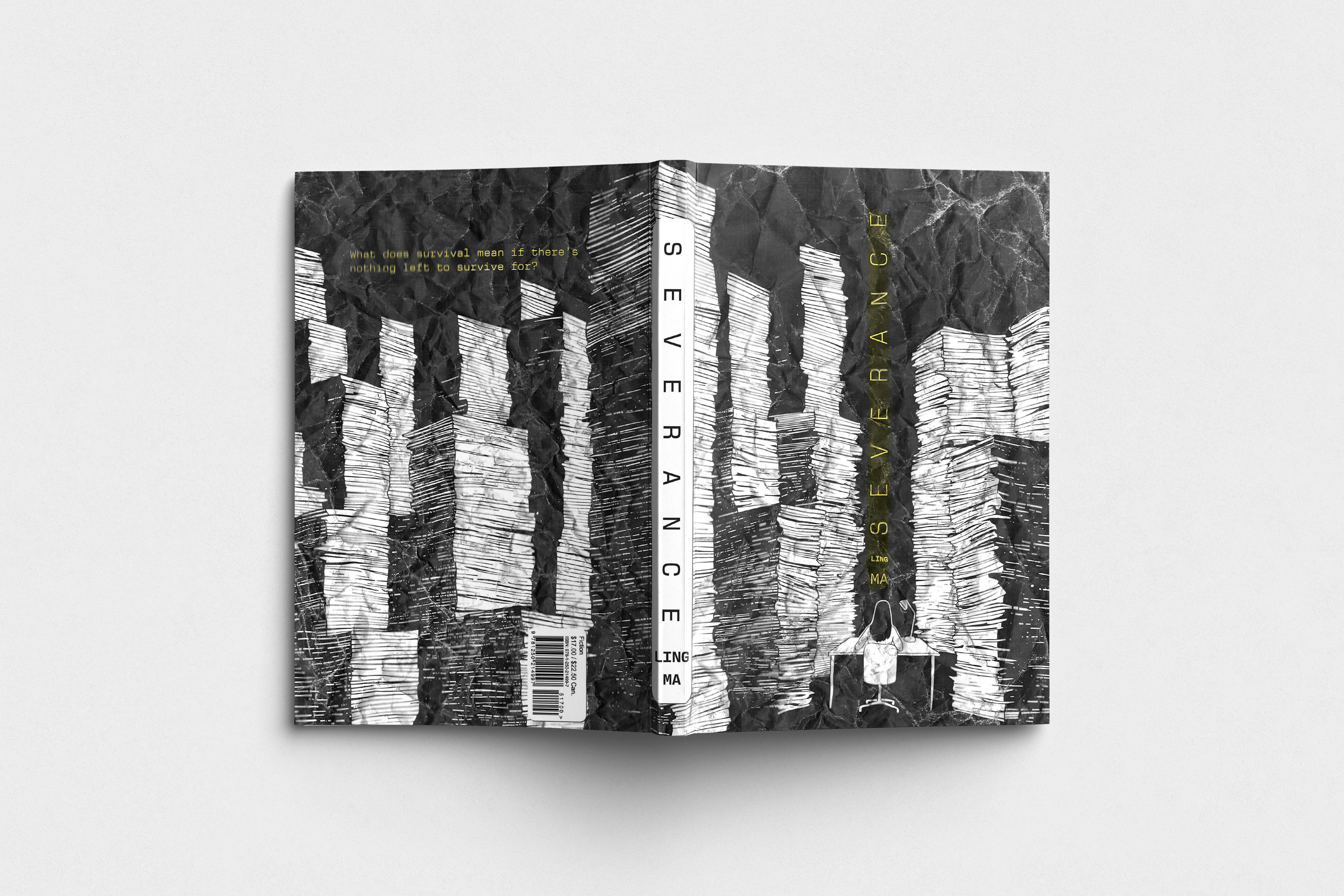
A strict structural grid begins to break down through repeated mechanical processing.
Controlled typography and rigid structure reflect institutional order before degradation sets in.
The blurred type results from repeated copier passes, creating real mechanical distortion rather than digital effects.
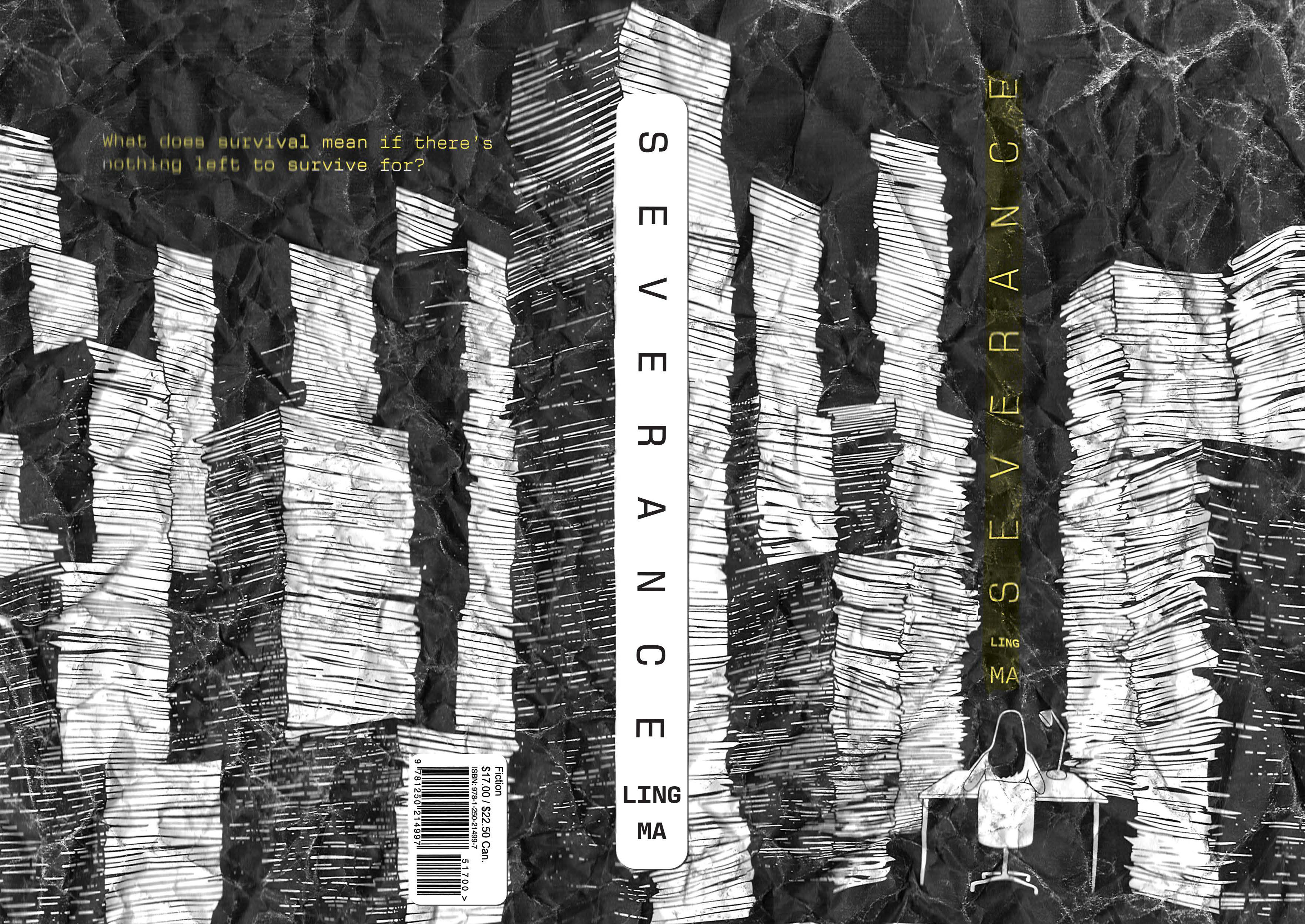
Close inspection reveals misregistration, softened edges, and tonal loss caused by accumulated repetition.